5 Mistakes to Avoid While Designing Channel Letter Signs
- Get link
- X
- Other Apps

Channel letters seemed to be one of the most commonly used types of science that businesses use. Even though all types of companies and brands widely use them, here are a few mistakes that almost everyone who is not a professional sign designer makes.
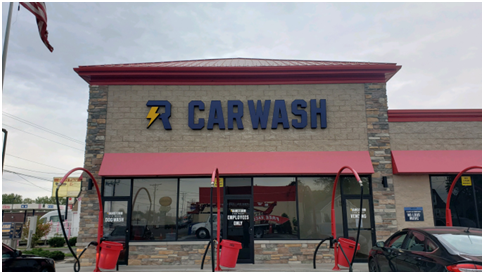
Using All Caps Fonts
We know it may seem like a good idea to grab more attention that way, but it is one of the worst mistakes you can make when you’re planning to put up channel letters signs. And all caps sign gives an unsophisticated impression. It would help if you always title-cased your letters in a channel letter sign.
Using All Cursive Text
Depending on what industry you belong to, using an all cursive text might seem like a tempting idea, but it’s not a good idea overall. This also creates legibility issues in the viewer, and it is also difficult to read from a distance.
Using Your Exact Brand Colors for the Entire Channel Letter Sign
It is common to design signage to ensure that a channel letter stands out prominently from its background. It inevitably means that the channel letters cannot be in a color blending into the environment. You have to make sure that you pick a color for the letters that are in a way contrasting to their background. For instance, if you’re putting a channel letter sign against a dark-colored building, the color you use for the sign should be light.
Not Using a Backer Panel
To improve your visibility and achieve a higher contrast level, backer panels are highly beneficial. Not every building will already have the colors to compliment your brand colors or the colors you want to use for your channel letter sign. In this case, you can also use LED channel letters that help your sign stand out.
Using a Small Letter Stroke
For your channel letter sign to be prominent, the letter stroke on it should be large enough to ensure that it is readable from an adequate distance. The bigger, the better. You’re always going to have to make sure that your sign is big enough for most people to read from afar. And using a bigger letter stroke inch ensures just at.
Whether you are planning on using regular channel letters or LED channel letters, you can contact our team in Davenport to set up a free consultation call, and we shall help you decide what type of channel letter sign your brand needs.
Source: https://quadcitycustomsigns.com/5-mistakes-to-avoid-while-designing-channel-letter-signs/
- Get link
- X
- Other Apps


Comments
Post a Comment